UX/UI Case Study • Product Page Optimization

Product Comparison That Converts

A comparison element designed for MEDION product pages to help users evaluate products more easily and make faster, more confident purchase decisions.

Product Comparison Element Case Study

The Objective

The goal was to improve the product comparison experience on MEDION product pages. Users needed a clearer way to evaluate similar products, understand key differences and make confident purchase decisions without leaving the product context.

The Execution

I designed, implemented and tested a comparison element that highlights relevant product information in a structured and easy-to-scan layout. The solution was created in Figma, built with HTML, CSS and JavaScript, and tested through Dynamic Yield to evaluate its impact on the product page experience.

The Process

The process started by analyzing the product page context and identifying where users might need support when comparing similar products. I explored how product information could be structured more clearly, designed the comparison element in Figma, implemented it with HTML, CSS and JavaScript, and prepared it for testing through Dynamic Yield.

The Outcome

The A/B test showed that the comparison element created a stronger interaction point on the product detail page. Users spent more time engaging with product information, compared products more easily and showed clearer purchase intent.

After successful validation through Dynamic Yield, the solution was implemented as part of the product page experience.
Measured Impact

Validated through A/B testing.

01

Stronger Interaction

The comparison element became a more relevant interaction point on the product detail page.

02

More Time on PDP

Users spent more time engaging with product information and comparing relevant product details.

03

Clearer Decisions

The structured comparison helped users understand key differences and make decisions with more confidence.

04

Successfully Implemented

After validation through Dynamic Yield, the solution was implemented into the product page experience.

A/B
Project Screens
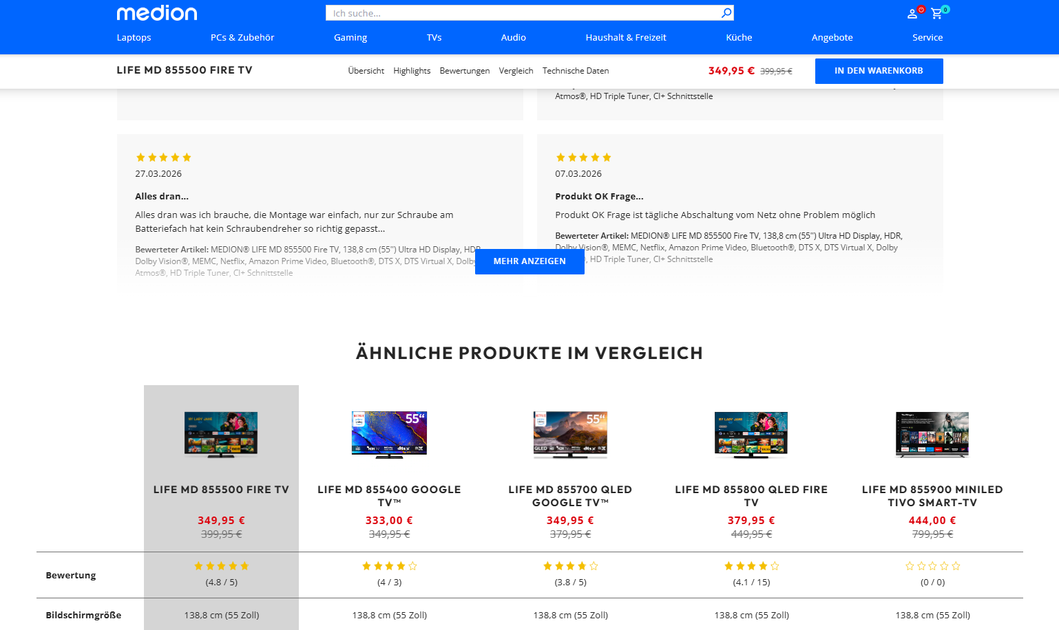
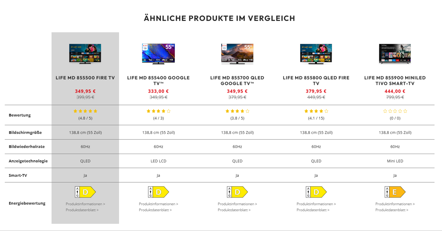
Final UI

Product comparison element implemented on the product detail page.

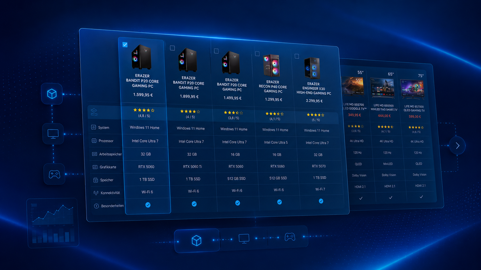
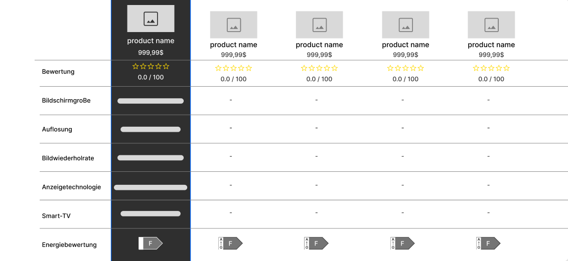
Wireframe Concept

A low-fidelity structure used to define the comparison layout, product columns and key attributes.

Before & After

Introducing the comparison module made the product detail page more informative, actionable and easier to navigate.

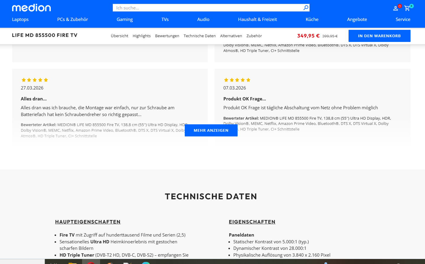
Before Product detail page before comparison element
After Product detail page after comparison element
Key Takeaways

What this project shows.

01

Design within real constraints

The solution was shaped around technical limitations, product-page requirements and realistic implementation possibilities.

02

Make comparison easier

Product information was structured to help users understand key differences and compare similar products more confidently.

03

Validate before rollout

The element was tested through Dynamic Yield before being implemented as part of the product detail page experience.