



Concept Project · UX Case Study · Platform Redesign

Redesigning Coursera to improve learner motivation and course completion.

A UX/UI concept project exploring how Coursera could better support learners through clearer guidance, progress-driven motivation and a more human learning experience.

UX Research Problem Framing Product Thinking UI Concept Design User Feedback
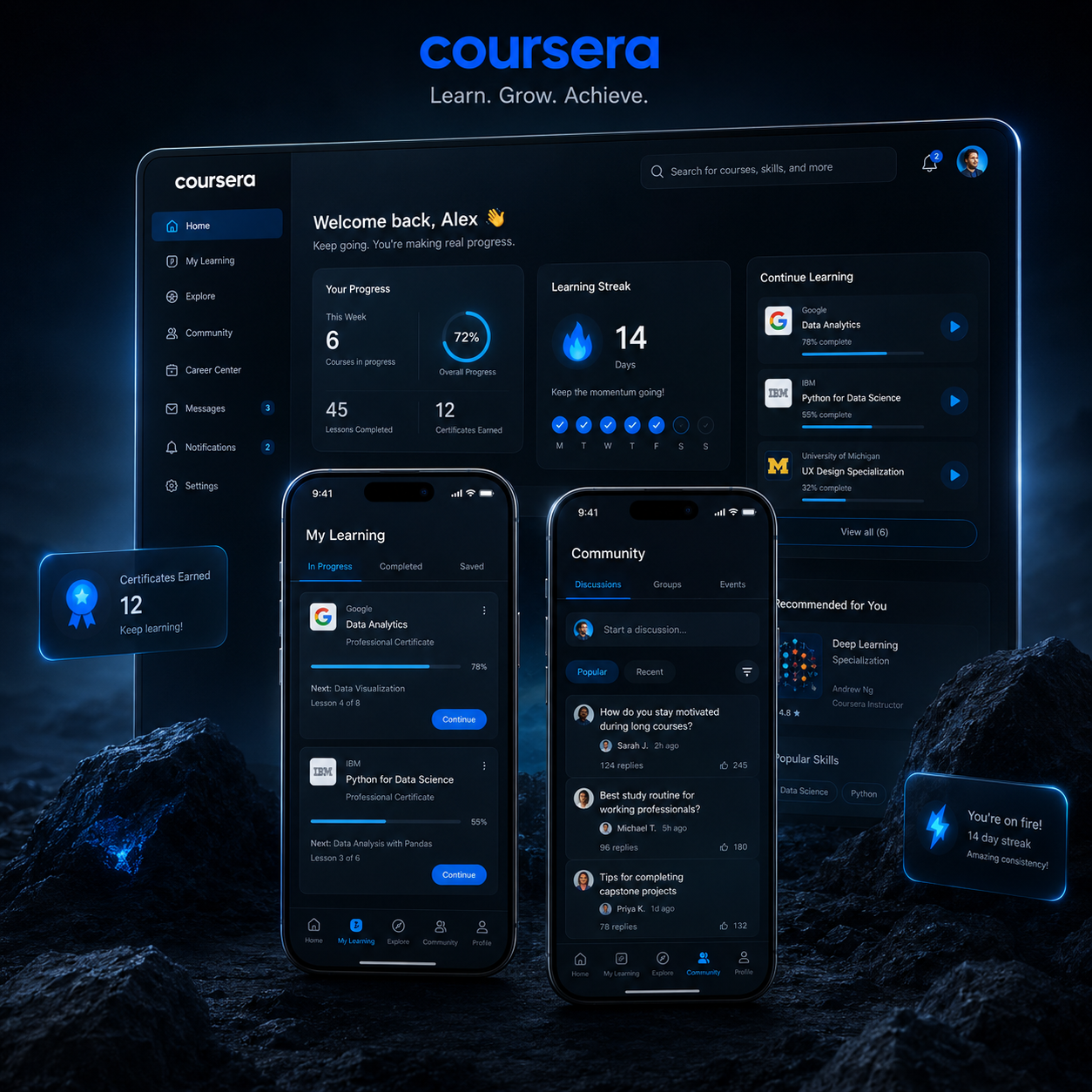
Coursera redesign concept interface
Project Type

UX/UI Redesign Concept

Independent concept case study based on Coursera’s learning experience.

Role

UX/UI Designer

Research, problem framing, concept development and mobile UI design.

Collaboration

2 UX Designers

Created together with another UX designer as a collaborative case study.

Methods

Research to Validation

Desk research, user interviews, competitive analysis, prioritization and user feedback.

Case Study Journey

A full UX process from problem discovery to concept validation.

This case study follows a structured UX process: understanding learner pain points, identifying patterns, prioritizing opportunities and designing concepts that support motivation, clarity and course completion.

Context & Problem

Understanding why learners lose motivation and drop off during online courses.

Research & Insights

Exploring learner frustrations through desk research, interviews and real user stories.

Competitive Analysis

Identifying engagement patterns and missed opportunities across learning platforms.

Ideation & Prioritization

Using an impact-effort matrix to focus on ideas with the strongest UX value.

Concept Solutions

Designing mobile-first features around progress, structure, community and motivation.

Feedback & Learnings

Testing ideas with learners and identifying what improved clarity and guidance.

Important Note

This is a conceptual redesign project created for portfolio purposes. It is not affiliated with or endorsed by Coursera. The goal was to apply UX methodologies to identify real learner problems and design meaningful improvements for the learning experience.

Context & Problem

Many learners start motivated, but struggle to stay consistent.

Coursera offers access to high-quality learning, but many learners lose momentum after the first modules. The experience can feel demanding, isolated and difficult to continue when progress, guidance and motivation are not clearly supported.

Problem Statement

How might we help online learners stay motivated, understand their progress and complete courses with more confidence?

01

Motivation fades quickly

Learners often begin with strong intent, but lose motivation when progress feels slow or invisible.

02

Course structure feels heavy

Long lessons, unclear next steps and demanding content can make learning feel overwhelming.

03

Learning feels isolated

Without visible activity, feedback or community signals, learners can feel disconnected from the process.

Research & Insights

Understanding why learners lose momentum.

Research helped us move beyond assumptions and identify the real reasons learners struggle to stay consistent.

Research Board

Learner pain points translated into UX opportunities.

Core Problem Course drop-off
Finding 01 Motivation fades
Finding 02 Progress feels unclear
Finding 03 Learning feels isolated
“I start motivated, but after a while I lose track of where I am and what to do next.”

Motivation needs visible progress

Learners need clearer signs that their effort is building toward something meaningful.

Structure reduces overwhelm

Long courses become easier to continue when next steps, effort and progress are clearer.

Community creates momentum

Visible learner activity and discussion signals can make the experience feel less isolated.

Feedback should feel active

Timely guidance, encouragement and milestones can help learners regain confidence.

Desk Research User Interviews Competitor Review Pain Point Mapping
Competitive Analysis

Learning from platforms that keep users engaged.

We compared Coursera with other learning platforms to understand how they support motivation, progress visibility, course continuity and learner engagement.

Clear course previews

Strong previews and structured course details help learners understand what they will get before committing.

Continue watching

Clear resume patterns reduce friction and make it easier for learners to return after a break.

Community activity

Discussions, projects and visible learner activity create a stronger sense of participation.

Coursera Opportunity

More visible motivation loops

Coursera could better support completion by making progress, guidance and social learning more visible.

Key Opportunity

The redesign should make learning feel less passive by adding clearer progress signals, stronger return paths and more visible motivation cues.

Ideation & Prioritization

Turning research insights into focused design opportunities.

Based on the research findings, we explored several solution ideas and prioritized them by user impact and implementation effort. This helped us focus on concepts that could meaningfully support motivation, clarity and course completion.

Decision Framework

We used an impact–effort matrix to decide which concepts were worth developing further.

Ideas with high user value and realistic effort were prioritized first. More complex ideas were kept as future opportunities or explored only when they supported the main learner problems.

Selected Direction Progress, guidance and motivation loops
High Impact
Low Impact
Low Effort
High Effort
Quick Wins
Certificate Value Preview
Timeboxing Mode
Course Start Signal
Strategic Concepts
Gamified Streak System
Community Pulse Widget
Pre-Course Level Check
Nice to Have
Minor UI Polish
Simple Reminder Copy
Future Ideas
AI Tutor Assistant
Full Peer Matching
Concept Solutions

Design concepts focused on motivation, clarity and completion.

Based on research insights and prioritization, we designed mobile-first concepts that help learners understand value, plan their learning time, stay motivated and feel more connected during the course journey.

Solution 01

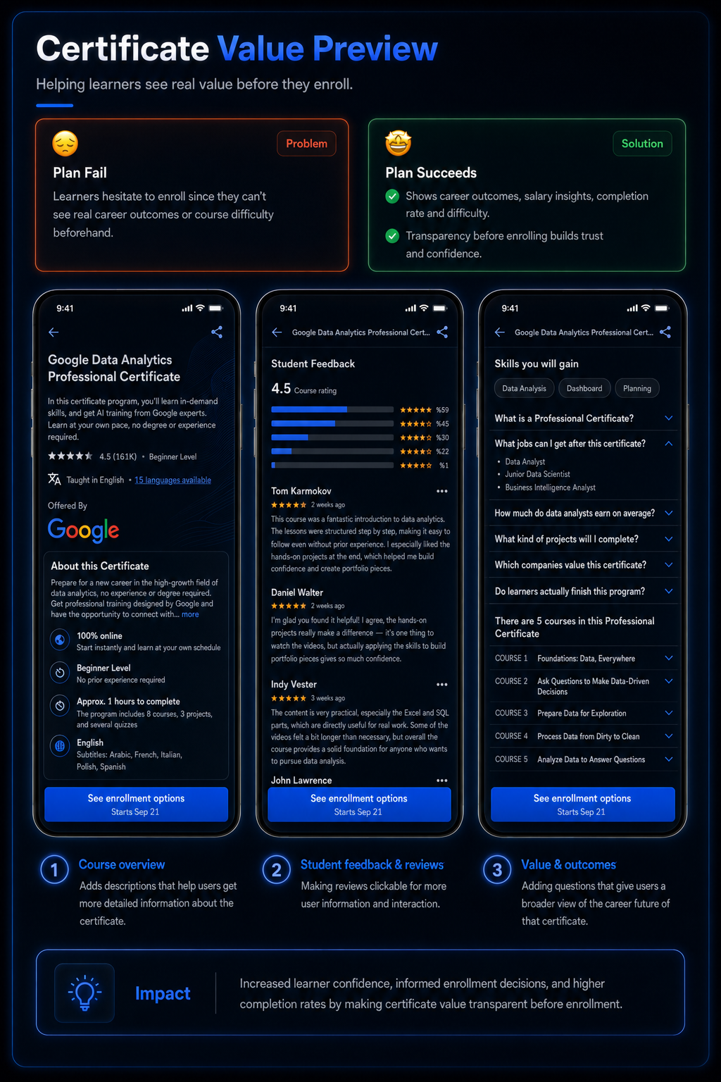
Certificate Value Preview

Learners often hesitate before enrolling because the value of a course is not always clear. This concept makes certificate outcomes, career relevance and learner proof more visible before commitment.

Problem

Learners do not always understand why a course is worth completing.

UX Goal

Increase perceived value before enrollment.
Certificate value preview concept for Coursera
Solution 02

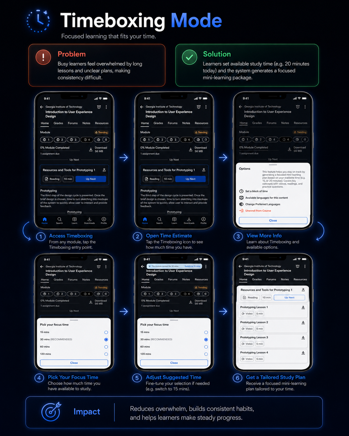
Timeboxing Mode

Long courses can feel overwhelming. Timeboxing helps learners choose how much time they have and turns course content into a more manageable learning session.

Problem

Learners postpone progress when courses feel too long or unclear.

UX Goal

Make learning feel easier to start and continue.

Timeboxing mode concept for Coursera learning sessions
Solution 03

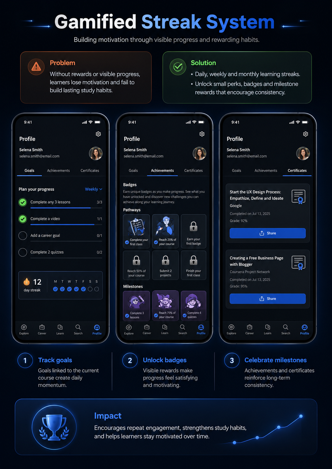
Gamified Streak System

Progress becomes more motivating when learners can see goals, milestones and achievements. This concept adds lightweight motivation loops without turning the experience into a game.

Problem

Motivation fades when progress feels invisible.

UX Goal

Support consistency through visible progress and small rewards.

Gamified streak system concept for Coursera
Solution 04

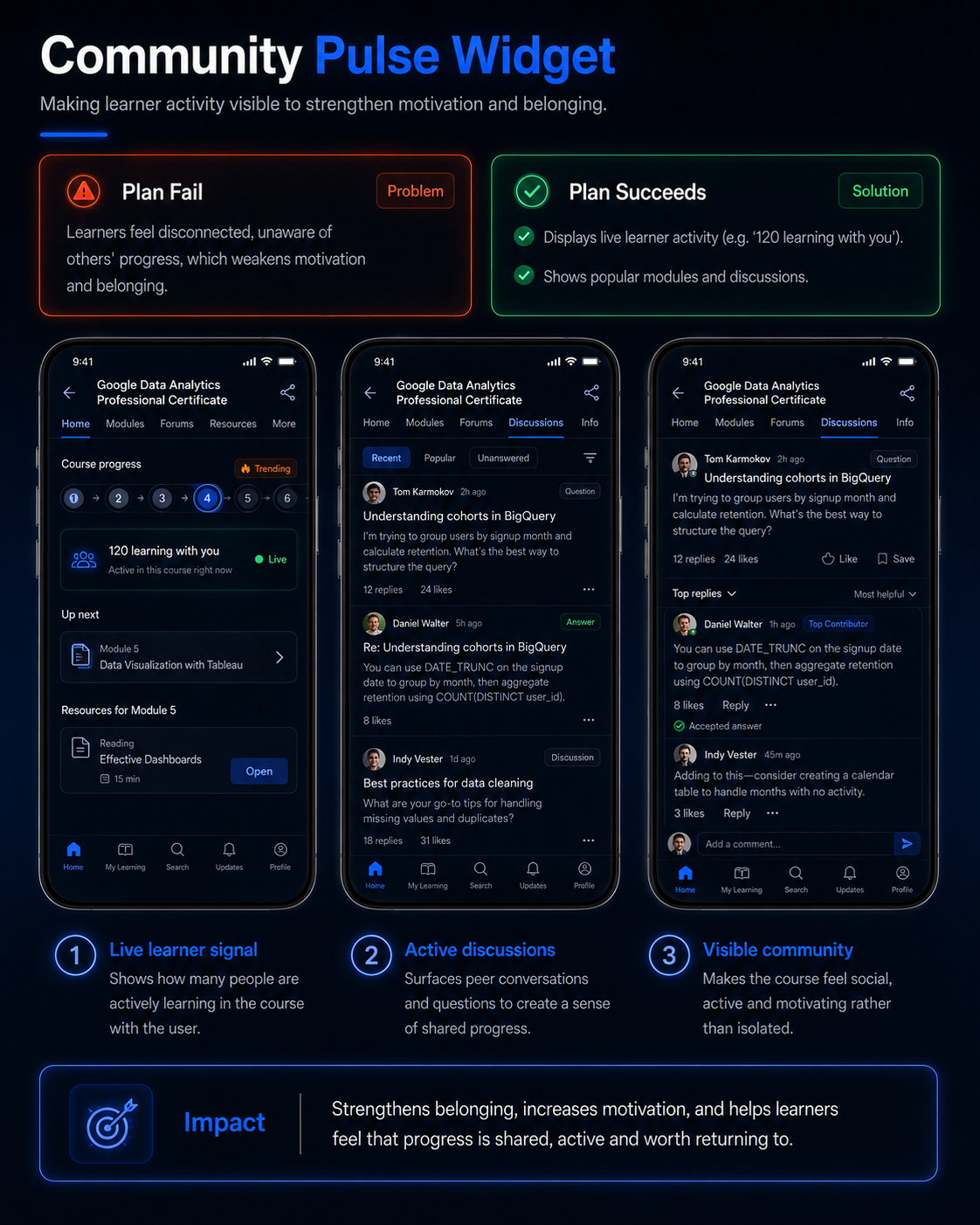
Community Pulse Widget

Learners can feel isolated when they do not see activity from others. This concept introduces social signals such as active learners, popular discussions and shared progress.

Problem

The learning experience can feel disconnected and lonely.

UX Goal

Create a stronger sense of learning together.

Community pulse widget concept for Coursera
Final Takeaways

What this project shows about my UX process.

This concept case study demonstrates how research, problem framing, prioritization and interface design can work together to create a more supportive learning experience.

UX Reflection

Good UX is not only about adding features. It is about understanding why users lose momentum and designing the right support at the right moment.

Research-driven decisions

The project started with learner pain points, desk research, interviews and competitor analysis instead of jumping directly into visual design.

Clear problem framing

The main challenge was translated into focused UX opportunities around motivation, guidance, progress visibility and course completion.

Concepts with purpose

Each proposed feature was connected to a user need, from time-based learning support to visible milestones and community signals.

Validation mindset

User feedback helped evaluate which concepts made the experience feel clearer, more motivating and easier to continue.